5 CSS Practices To Avoid as a Web Developer
Some bad habits and how to fix them
Some people think that CSS is difficult to learn. There are lots of crutches and even some magic, which makes it easy to shoot yourself in the foot. I feel sad about this since I don’t think so.
After some thought about what can be done, I’ve come up with five developer habits that I don’t like and will show you how to avoid them.
1. Set Margins or Padding and Then Reset Them
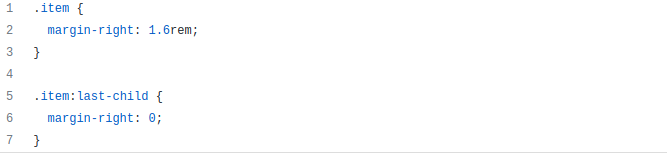
I often see people set margins or padding for all elements and then reset them for the first or last element. I don’t know why they use two rules when you can get by with one. It’s much easier to set margins and padding for all the required elements at once.
Use one of the following for simpler and more concise CSS: nth-child/nth-of-type selectors, the :not() pseudo-class, or the adjacent sibling combinator better known as +.
Do not do this:
You can use:

Or:

Or:

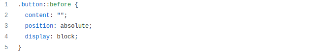
2. Add display: block for Elements With position: absolute or position: fixed
Did you know that you don’t need to add display: block for elements with position: absolute or position: fixed since it happens by default?
Also, if you use inline-* values, they will change as follows: inline or inline-block will change to block, inline-flex -> flex, inline-grid -> grid, and inline-table -> table.
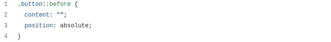
So, just write position: absolute or position: fixed and add display only when you need flex or grid values.
Do not do this:
You can use:
O
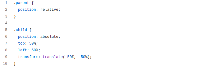
3. Use transform: translate (-50%, -50%) To Center
There was a popular problem that used to cause a lot of trouble. This lasted until 2015, and all its solutions led to some kind of difficulties. I’m talking about centering an element with an arbitrary height along two axes.
In particular, one solution was to use a combination of absolute positioning and the transform property. This technique caused blurry text issues in Chromium-based browsers.
But after the introduction of flexbox, this technique, in my opinion, is no longer relevant. The thing is that it cannot solve the problem of blurry text. What’s more, it makes you use five properties. So, I would like to share a trick that can reduce the code to two properties.
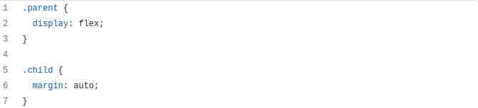
We can use margin: auto inside a flex container and the browser will center the element. Just two properties and that’s it.
Do not do this:
You can use:
4. Use width: 100% for Block Elements
We often use flexbox to create a multi-column grid that gradually converts to a single column.
And to convert the grid to one column, developers use width: 100%. I don’t understand why they do it. The grid elements are block elements that can do this by default without using additional properties.
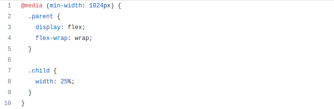
So we don’t need to use width: 100%, but rather we should write the media query so that flexbox is only used to create a multi-column grid.
Do not do this:
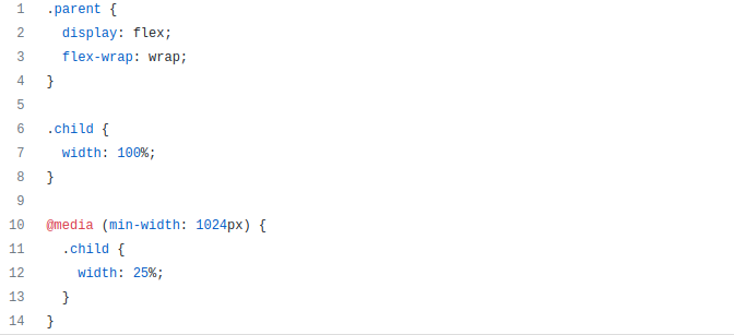
You can use:
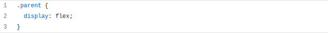
5. Set display: block for Flex Items
When using flexbox, it is important to remember that when you create a flex container (add display: flex), all children (flex items) become blockified.
This means that the elements are set to display and can only have block values. Accordingly, if you set inline or inline-block, it will change to block, inline-flex -> flex, inline-grid -> grid, and inline-table -> table.
So, don’t add display: block to flex items. The browser will do it for you.
Do not do this:
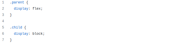
You can use:
Conclusion
I hope I’ve managed to show you how to avoid simple mistakes and you will take my advice. Thanks for reading!
Happy Hacking!


